Adam Pearce


Larry sketched out a Hans Rosling-style connected scatter plot about democracy and I turned it into an unstyled animation with a bit of d3.
The tricky bit: he was producing an actual video, not a webpage. I found an objectively bad way of exporting a d3 animation as a video by taking a bunch of screenshots with a headless browser and stitching them together.
I wish there was an easier way of doing this. Chart Party does incredibly creative work and I think some of that’s because video lets you walk people through complex forms in a way that’s even more friendly than scrolling. I’d like to try, but learning a whole new way of working, especially with something that requires sharing more of yourself, is daunting.
Basically a stacked bar chart with two twists.
First, labeling the states lets you follow an individual state over time. States that change are highlighted with bolding and tweaking the sort order so you can easily count how many states switched into each group. This doesn’t do great job highlighting which group the state switched from, but that’s not too important here since the progression is always No Law → Ban → Legal.
Second, the baseline is adjusted to puts more emphasis on the total number of places with bans, giving the whole shape a fun outline.
Amanda and Kevin did most of the charting work on this piece - I just got pulled in as an expert dot animator.
We started out with a SVG animation, tried out Elijah’s canvas sankey particles and ended up rewriting in regl to get more dots on the screen.
This piece probably has the worst data to ink ratio of anything I’ve made; 10,000 dots to show 10 data points. I think it would have been interesting to try show more of distributions across race/sex/parent income at once, but when you’ve got such important numbers going big on a couple of them can work.
I got a reader email complaining how long it took watch the animation, and made a static version incorporating some of his suggestions. Definitely more information-dense, but it doesn’t have quite the same impact.
After seeing Axios’s piece on Black Panther becoming one of the highest (non-inflation adjusted) grossing movies of all time, I was curious how many other movies had done so. Originally, I copied the step interpolation - it looks cool! - but Lisa’s post convinced me that it was a little misleading for continuous cumulative data.
I like the scrubbability of seeing the scale suddenly increase when there’s a new record, but some of the drama gets lost if you scroll too quickly. Updating the y scale elastically (like this path or this zoom) instead of instantly might have worked better.
Grabbing data from Axios instead of having to find it, scrape it and check for errors is the best. In theory, I should have updated with more recent data (Infinity War!) and gotten a better sample of top grossing movies in the 80s…
I got the idea for this piece after the Feburary dip in stock prices and seeing comments like “I like to look at it as stocks going on sale. Time to buy!”. Is it actually better to buy after a dip in prices? Or should you sell?
Elliot Bently made a trading simulator for the WSJ last year that came close to answering my question, but trying to understand the impact of tweaking the trading thresholds required fiddling with a text field and waiting for an animation to play. Animations are good for introducing a concept, but they start to get frustrating when they block interaction.
Besides disabling the animation, I took a step and a half up the ladder of abstraction and showed the entire space of different trading thresholds with a series of heatmaps. People don’t click on buttons as much as we’d like to imagine and mobile is a huge design constraint, but I don’t think graphics desks are exploiting the possiblies of the medium when we don’t give readers a chance to explore and examine our models without pulling down an IPython Notebook.
Making something like this is more work; the rough draft got banged out in an evening, but all the polishing touches took more time to get right and the code ended up pretty ugly (didn’t want to prematurally optimize, but dragging the date slider was laggy so I hacked in caching without cleanly rewriting, thinking the finish line was close… it wasn’t).
My brother helped me update the rules for three-way ties after they changed this year. The grid design didn’t change much from the first sketch. To stuff in more at-glance information, I added bars showing high impact matches and a final small multiples slide.
Since this was for my blog I took a bike ride yesterday instead of making a mobile version ¯\_(ツ)_/¯
About 30 seconds after walking back into the office post-paternity leave, Tom grabbed me: “Do you have a minute? We want to look at Democratic primary turnout.”
I put my bag down and started pulling party turnout numbers from secretary of state websites. The mechanics of party registration vary state to state, and states that did breakdown turnout by party were slow to post results. So we tried counting voters by just summing votes for Democratic and Republican candidates. House races didn’t work for this–lots of seats don’t have a primary–but we could compare turnout in states with a governor or senate race in 2014 and 2018. It looked interesting, but there wasn’t quite enough there to hang a story on.
So we decided to zoom in and compare turnout in house races. My first attempt was a log-scaled scatter plot showing how turnout shifted for both parties. Nice and dense! After annonations didn’t increase readabilty we started to worry it might be too complex. I still think it might have been doable with some rotation and quadrant labeling.
Larry suggested trying out a less dense form, so I sketched the distrubution of how turnout shifted for each party in each race. This suggested a simpler metric: instead of trying to show how both parties’ turnout changed, just use the change in partisan vote share. Haeyoun was curious if the Democratic share was up more in competive races, so I made slope charts faceted by the race’s Cook rating. Since we didn’t have data on a ton of races (the AP only reports vote totals for contested primaries and we needed vote totals for both parties in both years; a surprising number of primaries go uncontested), I switched over to small multiples slope charts which needed even less explanation. To emphasize the direction of the slope even more, we put all the races that increased their Democratic turnout on the left. Pulling the competive races, all of which had increased Democratic vote share, to the top kept the breakdown that Haeyoun wanted and enlarging them created a key.
As we got closer to publication, Alex pointed out that we were missing lots of races in which readers would be interested. I drug my feet, not wanting to go back to dozens of secretary of state websites before realizing that I’d just need to copy/paste a single candidate’s votes to get the vote total for each uncontested race, not several candidates as I had when collecting senate turnout. This gave us a ton of races so I shrunk the slope charts down to fit 10 in a column, essentially making the whole thing a bar chart.
The design got postpublication pushback: “Readers don’t know where or what GA-4 is, you need to offer some human context.” There’s some truth to this. My reporting on this piece was done with spreadsheets and I didn’t have much to add about individual races. I know Ocasio-Cortez won my district, but couldn’t tell you my district number. Still, I didn’t want to add a section with photos of candidates and details about every single race. That’s been done dozens of times already! And turnout shifts in one race can be explained by its particulars; zooming out shows that there’s actually a trend. Matthew whipped up some maps with mapshaper to provide some of that context without overwelming the rest of the piece.
Missed my chance to make something about the Spurs’ 50 win streak, but still got my yearly LeBron chart in. He’s pretty good!
The design on the main chart didn’t change too much from my first sketch. The gap between players each year ends up a little too emphasized with the lines, but the connection really helps recall each year. Plus it looks nice. Kevin suggested a bar chart version with space for all the players’ names, but year encoding gets a little messy and including the 0 baseline makes the chart less dramatic.
I added labels for a few players and was thinking about using the little stat cards as a tooltip. Joe suggested laying out the cards by player so you could see their details without interacting (it makes a little bar chart in print!). Without anything to put in the tooltip, I tried just showing the name on hover.
That was super frustrating to use though; it takes so much mousing to read the chart. So I shrunk the circles and printed all the names directly on the chart.
I had planned on making a game-by-game stats share for every finals team, like I did for total playoff points last year. The cards used the historic small multiples space, so I put a bigger 2018 game-by-game chart on top. Was originally going to stack them on mobile, but Archie pointed out that you really want to see them side by side so I squeeze them together, dropping the player labels and reusing the y-axis. Wish I could have gotten some annotations in, but couldn’t find space. : /
The top still wasn’t simple so we put in a 2018 LeBron stat card to introduce the piece.
Also pitched for the 2018 playoffs: a histogram of histograms.
When Crowley got primaried after not facing a primary opponent for over decade, Troy wondered how unusual it was to have a streak of uncontested primaries. I had House primary data sitting around from the turnout project and whipped up a chart showing how long it had been since each incumbent had been challenged in a primary.
Trying to turn the piece around before the news cycle moved on, Troy started writing and I started checking the data. It was way messier than I had hoped. The FEC collects election results from states, but the names and FECIDs aren’t 100% consistent between years. We ended up spending a day checking everything.
I had big dreams of remaking the NFL streak chart, but the FEC didn’t start posting spreadsheets till 2000. So we stuck to current incumbents. Going back farther, the results degrade from HTML in 1998 to PDF in 1994 to not proving primary results in 1992. DeLauro and Lowey still had active unopposed streaks, so I called their offices to find out when they had their last primary–the person who picked up the phone for Lowey asked around for me and no one knew!
To provide more historical context, I made a line chart that didn’t relay on streaks. I wanted to get a little more information in it, so I switched to two stacked area charts showing the number of candidates in each House primary. To keep the piece focused on incumbents, I kept that form but switched to showing how often they were challenged and how often they won. If I had seen Boatright’s chart showing competitive challenges earlier, I would have added another layer showing the percentage of incumbents facing non-competitive primaries.
Troy did all the styling and fixes in illustrator, like making time go left to right (whoops). I wish there was more time to report out why incumbents aren’t challenged: the Queens machine and New York ballot access create some formidable barriers. But between Kennedy retiring and a mass shooting, we had already missed the beat of the news cycle.
I tweeted this out after the news broke. Getting it inside of our CMS took longer than making the chart! And I think it looks worse; taking off the monospace makes the columns less bar-like (typography is an object) and requiring the title on top stopped it from directly labeling the x-axis.
A reddit user suggested that I learn a data vis tool besides d3:
You could have made this in Microsoft Paint. Why go through the additional effort.
Sure, the Post had the best hurricane tracker maps. But they use my tutorial to make one of them!
With the data file getting bigger and bigger during the storm, the Post reduced the temporal resoultion of their animation. I didn’t. Keeping the data hourly really shows the movement of the storm. And if loading a 10 MB file on the page was a bad idea, why is there a 50 MB video ad a little farther down? (On mobile, where bandwidth matters more, I decreased the spatial resolution).
While sticking the rainfall map at the bottom, I noticed I was having a hard time parsing the height of the bars when they stacked on top of each other. I added a gradient and a little curve so the color and angle of the curve would also encode the flooding height. Also they looked kind of like rain or water drops!
I’m not sure why we stuck with the bars; it got rushed to publication before we got a chance to hash it out.
My favorite chart from this project was for an internal dashboard. Call centers don’t usually provide real time results of polls; the best we could get them to do was 15 minute dumps of all the calls they had done that night, along with the start time of the call.
The timeseries and call stream animation assumed they recived the calls in order of start time; when they started showing on the front end unordered they caused lots of hard to track down bugs. I thought there was an error with our data processing, but by charting the call center timestamp against the upload time found that high call volumes led to a bottle neck. We ended up randomly distributing the new calls we recived over the next 15 minutes—not as magical as seeing them show up as they happened or exactly replayed, but the best we could do.
I didn’t end up watching too many polls come in as they happend. I really wanted to make the stream animation a little slicker and less laggy, but got bogged down coming up with awful hacks to cram our sleek 100kb svelte app inside of the NYT’s react app. Kids, always make sure everyone is on board with your publishing pipeline before you start working.
Didn’t think I would have time this year, but the fan art inspired me.
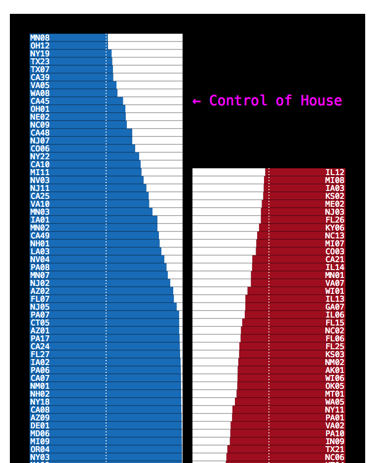
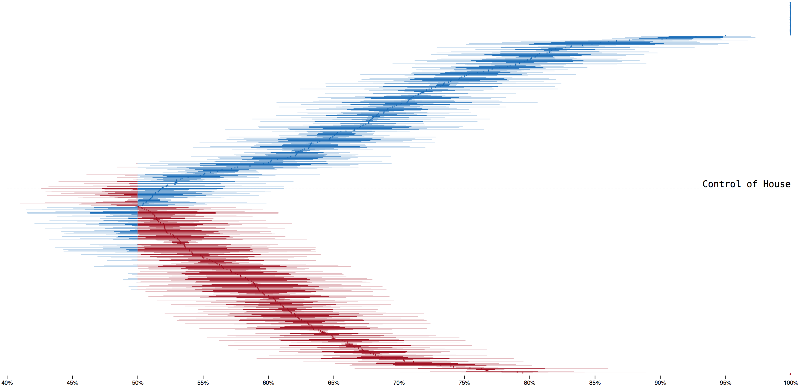
I tried lots of ideas for showing our model’s margin of uncertainty for house races. A lava lamp, a bouncing histogram, a grid of needles, a grid of every house race
To clearly show the balance of power, I stacked races each party was favored to win. This was a little tall, so I squeezed each house race down to a single vertical pixel and drew their range of possible outcomes. Too dense; with the lines adjacent it wasn’t clear they represented individual seats. And the closest races were stuck in the muddy middle of the chart.
Looking to create space between the lines without increasing the height of the chart, I layed the races out in an arc. This also pulled the closest races to the top of the chart, encoded the balance of power with the angle of the lines and also kinda looked like the needle at the top of the page. I thought it was great, but there were too many bewildered looks internally and we cut it.
Last spring I took a look at state and local election results, wondering if more Republican state legislators would lead to more pre-emption, The National Conference of State Legislatures tracks the number of legislators over time, so I tried plotting all of them (a line chart is probably a better way to show this information).
The raw number of representives also isn’t that meaningful (New Hampshire’s lower chamber has 400 members!), so I looked at control of upper and lower chambers in each state over the last hundred years with a cartogram. National trends are hard to pick out with this form; state boxes are only 70 pixels wide so each election is only a pixel wide.
To pull those trends out, I made a stacked “area” chart out of the state’s intitals. Changes in control are highlighted and the states with split chambers are vertically centered so the outline of the chart shows changes in control. I was happy with this form–it’d make a great poster!–but didn’t have a story to attach it to so it sat untouched till Bui and Emily started working on a post-midterms state legislative piece.
Bui built similar charts for governors and overall state control, then dropped the baseline to make them denser. I thought the shape of the outlines looked nice, but with three catorgies it is totally unnessary. After publishing, Kevin pointed the Times had previously published both types.
Troy did a mockup with fun lines. When I hooked up the real data and dropped the election night oscillations it wasn’t quite as interesting.
We tried using yellow to highlight recount zones, but it made the chart really noisy. Archie suggested cross hatching the zone and emphasizing the date ticks with a black background. And once we were closer to publishing, the real data was more exciting!
I knew this would be the last breaking news thing I’d work on so I tried to get the little touches right, sticking in a hover+opacity effect lifted from Gregor.
I moved to Sunnyside in late 2016, shortly before work was supposed to be finishing up on the 7 train’s signal modernizations. Work was just completed yesterday. I was curious what caused the delay and also will take any excuse to duel encode time.
Hoping to do more train charts, but getting people to answer your questions is a lot harder when you can’t say “I’m calling from the New York Times.”