Whale Words
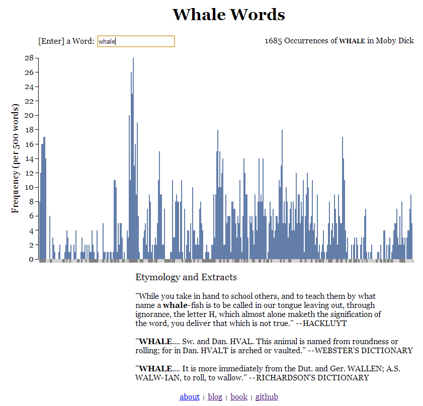
This is a display of word frequency in Moby Dick that I just finished making. It draws heavily on Bibly, which displays word frequency in the Bible.
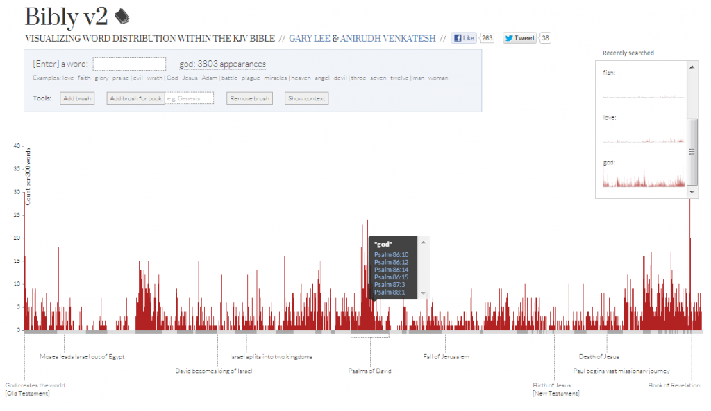 To get more practice with d3.js, I wrote everything from scratch. Having a visual reference was still extremely helpful, though. Some things I really liked about their implementation/would have run into trouble without:
- Grouping words into equally sized buckets to create a histogram. This sounds obvious, but I had some trouble getting to it. My first idea for this project came when I saw a infographic of word frequency in the Wire. I wanted to make an interactive version of the same data, showing the number of occurrences of each word per episode. Since each episode contains roughly the same amount of dialog, it would be relatively simple to draw a single bar for each episode. When I decided to work with Moby Dick instead, my first attempt drew one bar per chapter and with the variable width bars, it looked awful. Unable to find a solution, I put the project aside until I came across Bibly.
- The use of two colors of bars on the x-axis to detonate chapter length. I would have used tick marks, but solid bars are a significantly better visual metaphor for chapters which persist for the entirely of their length and aren’t one time events. Bars are also better mouseover targets.
- This might be a little silly, but I really like the ‘[Enter] a Word’ formulation. I tried a lot of different instructions for the splash page of redditgraphs, but really struggled finding one that was both concise and clear.
Some things I added or removed:
- An autocomplete drop down to text box.
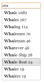 In addition to downloading the text of the Moby Dick (about 1 MB), the webpage also downloads an array containing all the none stop words in Moby Dick and the number of their occurrences (about .2 MB). Typing a few letters searches though the array for the most common words that match, then displays them and their frequencies in a drop down menu. This is pretty sweet for a couple of reasons. Displaying the frequency of many words at once increases the information density of the site – the drop down with no text entered yet basically shows as much information as the entire Wire infographic. At the same time, it increases usability (if the user doesn’t realize the need to press enter, the suggestions are click targets) and invites exploration (it is hard thinking of interesting words to search for on the fly, the autocomplete shows several of them at a time).
- The highlight functionality or the recent search display. I’ve been reading though public available portions of the cs488b syllabus and can see why Bibly included them, but I wanted to keep the page as simple as possible.
- Mousing over a bar immediately shows the corresponding quotation at the bottom of the page instead of showing tooltip with a list of quotations to click on.
- None of the height, width, word bucket size, or chapter length values depend on magic numbers. This makes it easy to resize the graph to fill the browser window, rescale the y-axis for different words, and potentially use the same code to display other books.
Some things that I would like to add or improve:
- Resizing the page after it has loaded should resize the graph too. I didn’t work with MVC in mind though, so it would take some work to implement this.
- Loading splash screen should have a loading bar or changing text.
- The text display should have a way to read more of the passage. Maybe clicking could open a new scrollable window containing the entire text with passage highlighted.
- The numbers on the autocomplete drop down should align to the right. This is surprisingly difficult to do without breaking jquery ui.
- It’d be super cool to include more books. Most of the process is automated, but some hand editing was required to the make the raw text from Project Gutenberg usable for the parseBook.py program I wrote. It would be feasible to do the same for the freely available texts in the St. John’s program. Alternatively (or additionally), if I wrote a parse parseEPUB.py program (which wouldn’t require any hand editing for each text since chapter titles are written in constant ways) and ran it server side, it might be possible to allow users to upload any book formatted as an EPUB without DRM that they own and display a graph for their book. I’m not sure how useful or used this would be; even if the user has and knows where to find an ebook on their hard drive, it will probably be from Amazon and/or contain DRM.
- While I was looking though the nltk documentation, I came across this graph: I’m not sure if it is a necessarily better display of the same information. Frequency is a little harder to discern and it just looks less interesting, but it takes up less spaces and opens up the possibly of easily comparing the frequency of different words.
 To get more practice with d3.js, I wrote everything from scratch. Having a visual reference was still extremely helpful, though. Some things I really liked about their implementation/would have run into trouble without:
 In addition to downloading the text of the Moby Dick (about 1 MB), the webpage also downloads an array containing all the none stop words in Moby Dick and the number of their occurrences (about .2 MB). Typing a few letters searches though the array for the most common words that match, then displays them and their frequencies in a drop down menu. This is pretty sweet for a couple of reasons. Displaying the frequency of many words at once increases the information density of the site – the drop down with no text entered yet basically shows as much information as the entire Wire infographic. At the same time, it increases usability (if the user doesn’t realize the need to press enter, the suggestions are click targets) and invites exploration (it is hard thinking of interesting words to search for on the fly, the autocomplete shows several of them at a time).