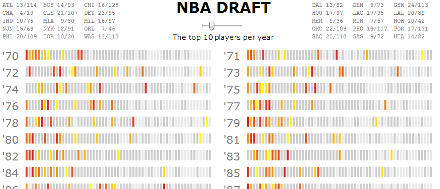
Interactive graphic comparing the top picks to the top performers in the NBA
This is another remake, courtesy of the NYT:
Assorted thoughts:
Clearer differences between players of different skill level. In basketball, there is a huge difference between the best player in a draft (Lebron James in 03) and the 5th best (David West in 03). Representing the top players with a gradient highlights these differences. Shades of grey also differentiate average players from those who never played. I'm not sure this color scheme would have worked as well with the NFL graphic since the larger drafts require thinner bars.
More information about players.
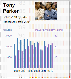
Instead of a tricky formula based on "number of starts, Pro Bowls and other factors," I went with the product of minutes played and player efficiency rating. Adding a chart of those numbers exposes those calculations and making it yearly creates a snapshot of a player's entire career. Looking at the bar graph in isolation now, it really looks like it needs axis tickmarks. In the context of the whole graphic though, they make things way too busy.
I also copied from the last two projects I worked on and added an image of each player to the tooltip.
Finally, clicking a bar opens a link with more information about the player which makes it significantly simpler for the viewer to continue finding things out.
Team specific information. To make it easier to find a player or see how a team has done over time, mousing over or clicking a team name highlights picks by that team. Moving the slider also updates each team's number of top picks. I'm a big fan of having animated transitions be accompanied by text updates. It makes the comparisons between two stats more concrete and quantitative while generating memorable takeaway numbers on the fly ("did you know that the Grizzlies have never drafted a top 3 player?"). I think the NYT's incorporation of this effect was more successful; by only updated two numbers at a time it could explain them in a sentence, drawing attention to them with bold text.
Because I was tacking on features, I ended up with a more cluttered display. I usually try to make the instructions only a sentence long to reduce the amount of text on the page. That wasn't possible here, so I ended up a big block of words at the end. I probably should add some images, color, and/or formatting to it but it has been almost a month since my last post and I'm ready to move onto the next project now.